April 2011 Status, Subway Station Planning and a Bus System

April sped by rather quickly, as least in part because I had some non-railroad distractions that took me away from the layout. Not much was done in concrete terms, but planning for the Riverside Crossing Subway Station made good progress. Mostly I acquired parts for some more power management wiring (PM42 circuit breakers, BDL168 occupancy detectors, and RX4 transponding sensors, as well as wire, terminal strips, and miscellaneous connectors). I also painted several sheets of cut-to-size plywood with primer, to which I’ll attach all the electronics and wiring. Then I’ll hang the plywood under the layout, where it can be easily wired to terminal strips, but remain far enough away from the track and bus wires to avoid interference with the transponding sensors. I’ll have more on this after I’ve built the first of these.
* * *
The Subway Station planning was more interesting. As I mentioned last time, I’d done a mock-up, and decided to use the newer style of Kato platform in the subway.
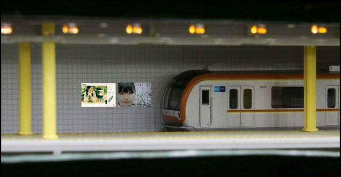
At the time, I’d been planning to use it bare, and find a way to deal with the holes in it used for mounting the girders that normally support the roof structure. After doing some research into prototypical Tōkyō subway stations, which all had pillars supporting the roof, and in particular seeing a Ginza station with riveted girder supports, I decided to try to re-use the girders from the platform to hold up a false ceiling. In a real subway station, the area above the platform is typically lower, and lighter colored (or at least better lit), than the area above the trains. I wanted to achieve some of that dimensionality, rather than just having a flat ceiling. It also helps convey the feeling of a claustrophobic and congested space. Note that this photo is entirely lit by the LED strip lighting installed at the front of the scene (the orangish rectangles at the top of the photo are the LEDs seen from the side). This has been white balanced to correct the color, which has a blue cast in person. I still haven’t found a way to correct that, although I’m working on a few ideas.
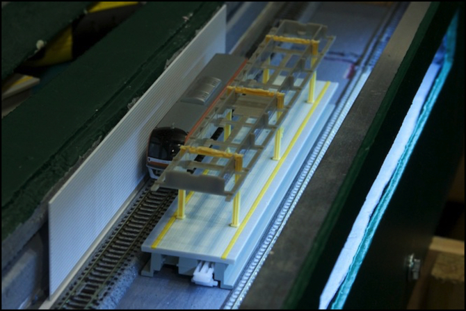
Below is a view from above (with the roof of the subway removed) showing how the mock-up fits into the space, and how the valence looks overall. The LED lighting has been turned on in this photo to show how the valence shadows the upper part of the tile wall.
Station mock-up #2
The photo at the top shows a test with the girders and the original structure that went underneath the roof, which is essentially a valence around the edge of the platform, with some castings just outside it that replicate fluorescent light units. This turned out to just fit under the real ceiling, if I removed the top section of the yellow girders. And the test photo looks quite good, so aside from painting the valence and girders, I expect I’m going to end up with something very much like it once I’m done.
Another aspect of the station seen in the top photo is the use of the back wall for advertisement billboards. I did some research online to identify some typical ads found in stations, and to try to judge how frequent and how large these were. The result was that they varied a lot, but that, at least in the Tōkyō stations I could find photos of, ads on the wall behind the tracks tended to be relatively small and infrequent. This was an odd finding, as I’ve seen numerous photos of very large ads used behind tracks on surface stations.
The ones shown here are just photoshopped onto the back wall, which is 0.40” (1.0 mm) Evergreen sheet styrene in their 4501 1/16” (1.6mm) Tile pattern). As shown, these are 8mm H x 22mm W, and represent a prototype ~1.2m (~4’) high, which appears to be a bit larger than typical subway outer wall ads, but not excessively so. Smaller ones would, I feel, just be a blob to a typical viewer.
Right now, my thought is that I’d put a pair this size, or one longer image, between each set of support girders (i.e., about every 100 mm), which should give me enough to break up the monotony of the tiled wall, while still looking a bit sparse. I may adjust those plans after I construct and assemble the first wall section (hopefully soon).
* * *
Another activity this month was the arrival of a pair of the Tomytec Bus System Basic Set A packages. I wrote these up a couple of weeks ago and mentioned the new page I added describing it. I’ve added a bit to that page describing a hill-climbing test I performed (the bus can climb an amazing grade of 20% fairly smoothly, and steeper grades with some visible slipping). There’s also a video, linked off that page or my Movies page.
One thing I’ve read online, but can’t confirm since I don’t have any Faller Car System vehicles, is that there is a significant difference between the Faller and Tomytec systems that could cause significant interoperability problems. The Faller reportedly uses a wire atop the roadway (hidden under paint, or at most a very thin layer of styrene) and relatively weak guiding magnets attached to the front wheels. The Tomytec system uses a very strong magnet, and wire attached to the underside of a fairly thick styrene roadway. Apparently Faller vehicles used with Tomytec roads don’t track reliably, and Tomytec vehicles used with Faller wire can seize the wire and not move.
This isn’t an issue for me, at least not today, but I thought it worth mentioning in case anyone reading this planned to try combining the two.
And with that, we’re caught up to the present. Things are moving forward, and I’m hopeful that May will see significantly more accomplished on the layout.
Other website changes:
- Added these and other photos to the Stations photo album.
- Updated my Reservation page to move the trains that arrived at the beginning of April to the Recent Arrivals page.
- Added some text about the above Subway Station work to the “Phase 2k” construction page.
- I renamed my page on Unitrack switches and added a couple of links to it to other pages (it had been tucked away in an obscure location after the last re-arrangement, and not properly integrated with the other pages).
- Updated the Musings Index page with April’s musings, which hadn’t been added.
== Comments from old system:
Monday, May 2, 2011 - 11:04 PM
quinntopia
The subway looks great. Brilliant idea! Great use of the LED lighting strips and the tile'd styrene for the back wall. The effect of having the lower, and more well-lit, platform area ceiling looks great. This is one of the best I've seen! Can't wait to see more on this!


